Design Challenge:
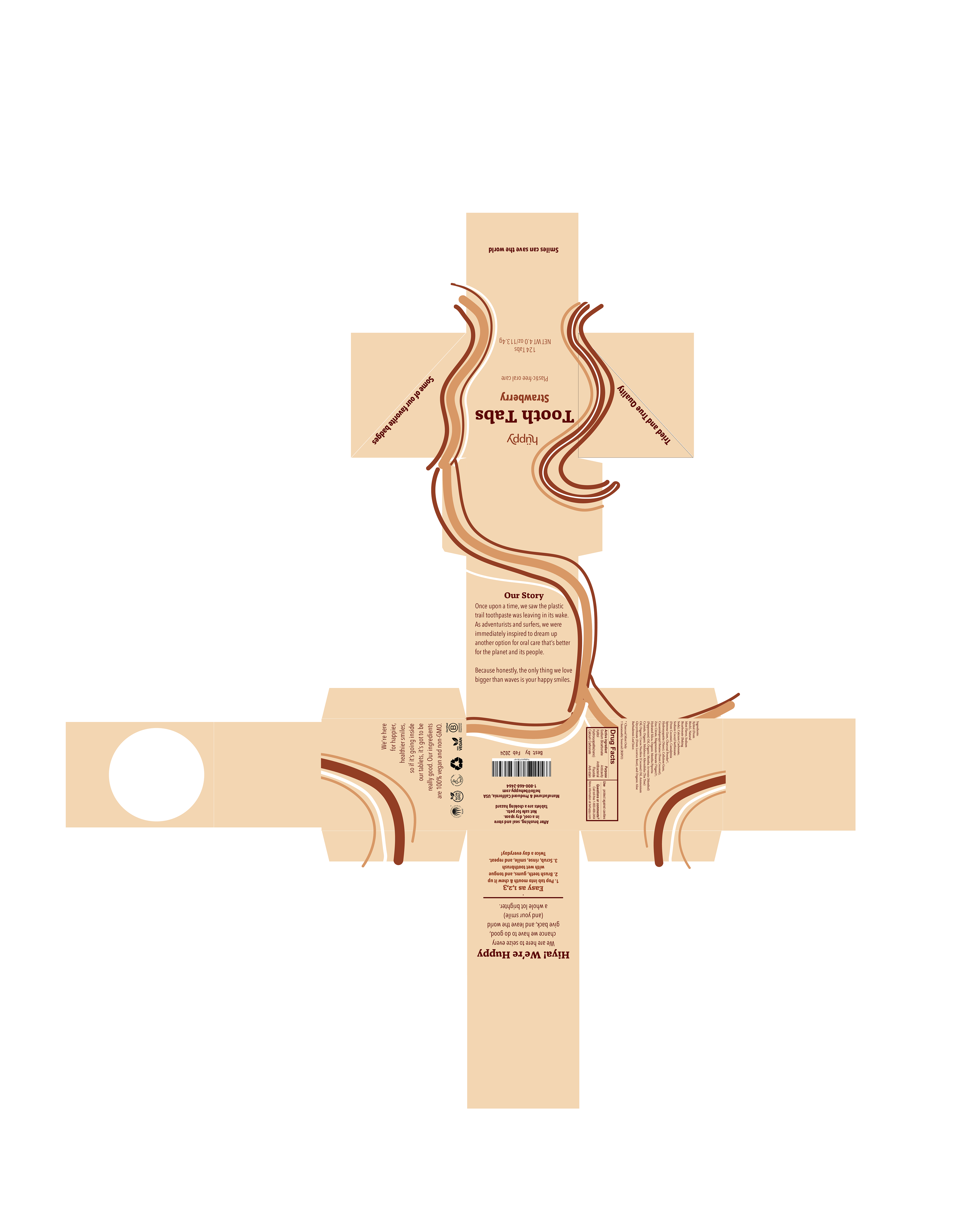
This challenge was centered around creating a unique series of corresponding labels and packaging for a line of sustainable toothpaste tablets sold by the brand Huppy. The purpose was to design functional, shelf-ready packaging for Huppy’s products that are currently exclusively sold online. Huppy competes with household name-brands such as Crest, Colgate, Arm & Hammer, etc., as well as other sustainable toothpaste brands such as Bite, Etee, and Battle Green.
Design Solution:
The inspiration for this package design was largely drawn from modern styles that include strong lines and natural colors, specifically the postmodernism aesthetic. The typefaces Alda OT CEV and Aveinr Next LT Pro Condensed work together to make the brand appear charming and trustworthy without feeling sterile like other competing brands. Because the product itself is rooted in sustainability and environmentally conscious ideals, the design naturally followed similar expectations. The glass vessel is food-safe, reusable, and marked with eye-catching– yet minimal– labels to reduce waste. The box design mimics color schemes and imagery from the glass jar in order to cohesively convey flavor information, as well as allow the jars to exist independently from the box, so that the original packaging can be recycled after purchase. The blue, green, and pink color systems share similar tones and saturations in order to compose unity within the line of varying toothpaste flavors. Each box is created with pearlescent paper as an ode to the pearly-white smiles Huppy’s product promises.


